
Improving Public Debt Management
In the OIC Member Countries
20
economic size of a country. To some extent, GDP may be regarded as a measure of the tax
potential of a country.
1
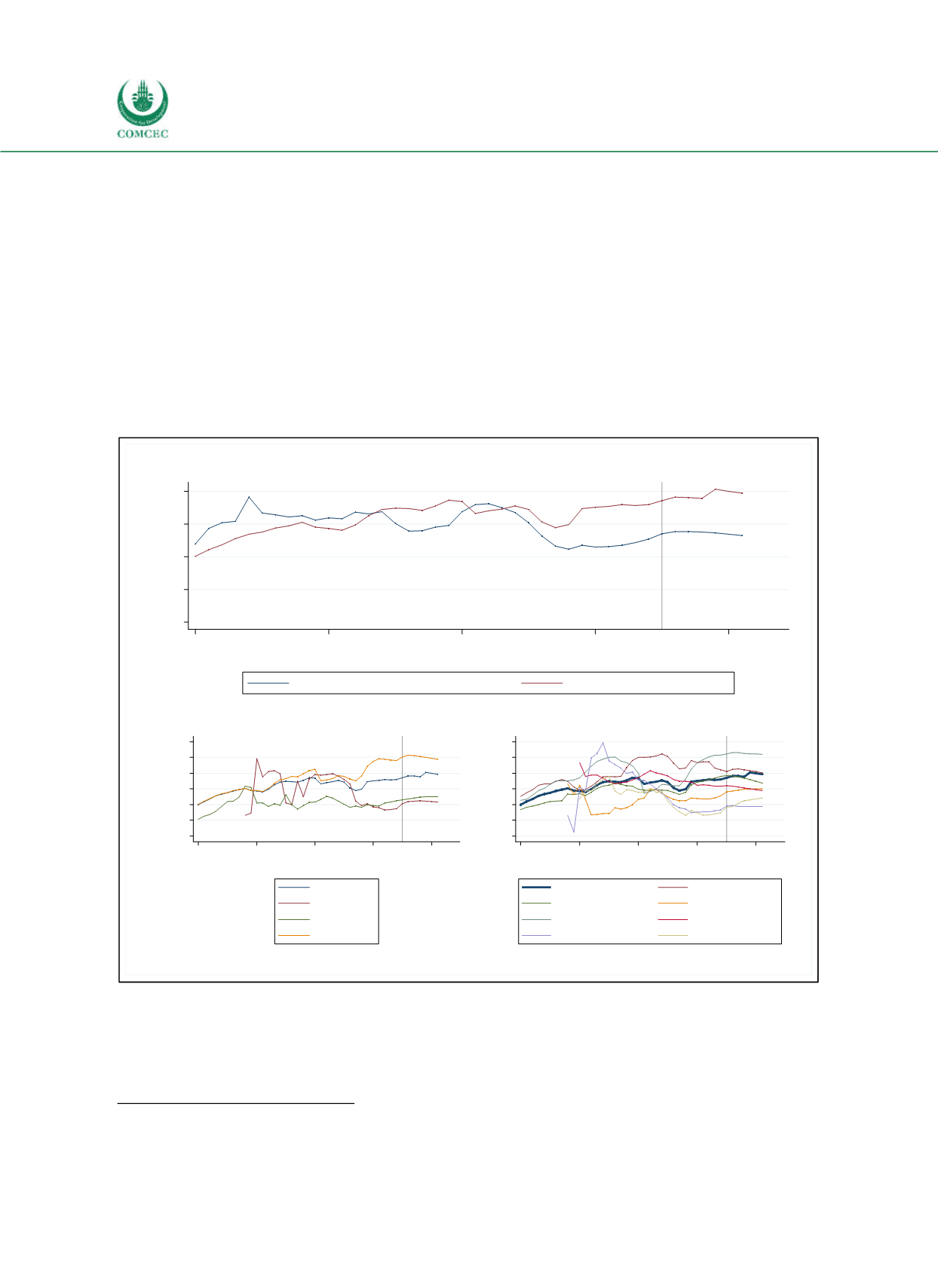
The upper panel of Figure 21 shows two different measures of average debt levels. The blue
line corresponds to the unweighted average of public debt relative to GDP across countries.
The red line is a measure of global indebtedness. It displays the ratio of the worldwide sum of
government debt relative to world GDP. Over the period of consideration, debt levels have
been located between 40% and 80% of GDP with a tendency to increase. Exceptions are the
periods just before and during the global financial crisis and the European sovereign debt
crisis. Debt levels are projected to rise further. While the current average debt level across
countries (blue line) lies below its mean across the period, debt has reached an
unprecedentedly high level if expressed as the aggregated worldwide level (red line).
Figure 2-1: Gross Public Debt Worldwide
Sources: WEO (2016), calculations by the Ifo Institute.
The lower panel of Figure 21 shows the evolution of debt for different countryincome groups
(left) and for different regions (right). In most years, relative sovereign debt in highincome
countries is larger than in middleincome and lowincome countries. This difference has
1
Alternatively, sovereign debt might be scaled by government revenues. This variable would provide information on
government’s ability to repay sovereign debt in the future.
0
20
40
60
80
Share of GDP (in %)
1980
1990
2000
2010
2020
Year
Public debt over GDP averaged across countries
Worldwide public debt over world GDP
Projections
0
20
40
60
80
100
120
Share of GDP (in %)
1980
1990
2000
2010
2020
Year
All
Low income
Middle income
High income
Projections
0
20
40
60
80
100
120
Share of GDP (in %)
1980
1990
2000
2010
2020
Year
All
East Asia, Pacific
Europe, Central Asia
Latin America & Carib.
North America
South Asia
Sub-Saharan Africa
MENA without Jordan
Projections


