


 27 / 108

20
Source
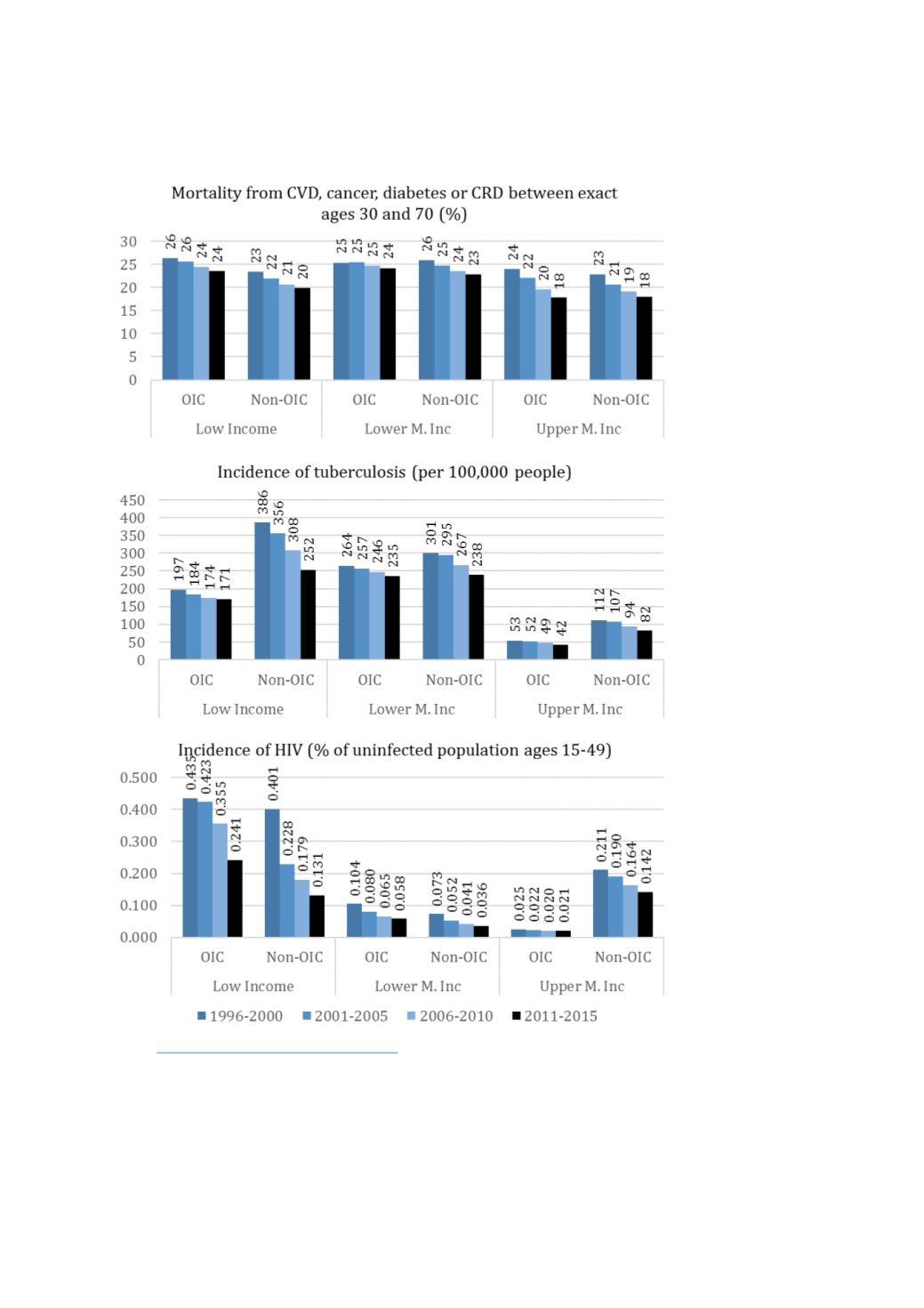
: https://data.worldbank.org/topic/healthThe life expectancy graph in
Figure 11clearly shows that all income-OIC subgroups have, over the
years, improved life expectancy. In addition, to state the expected, the population living in countries in
richer groups lives longer compared to those in poorer countries. Underneath this overall picture,
there are some lessons that may be relevant for OIC countries.
The comparison of OIC vs. non-OIC