


 73 / 108

65
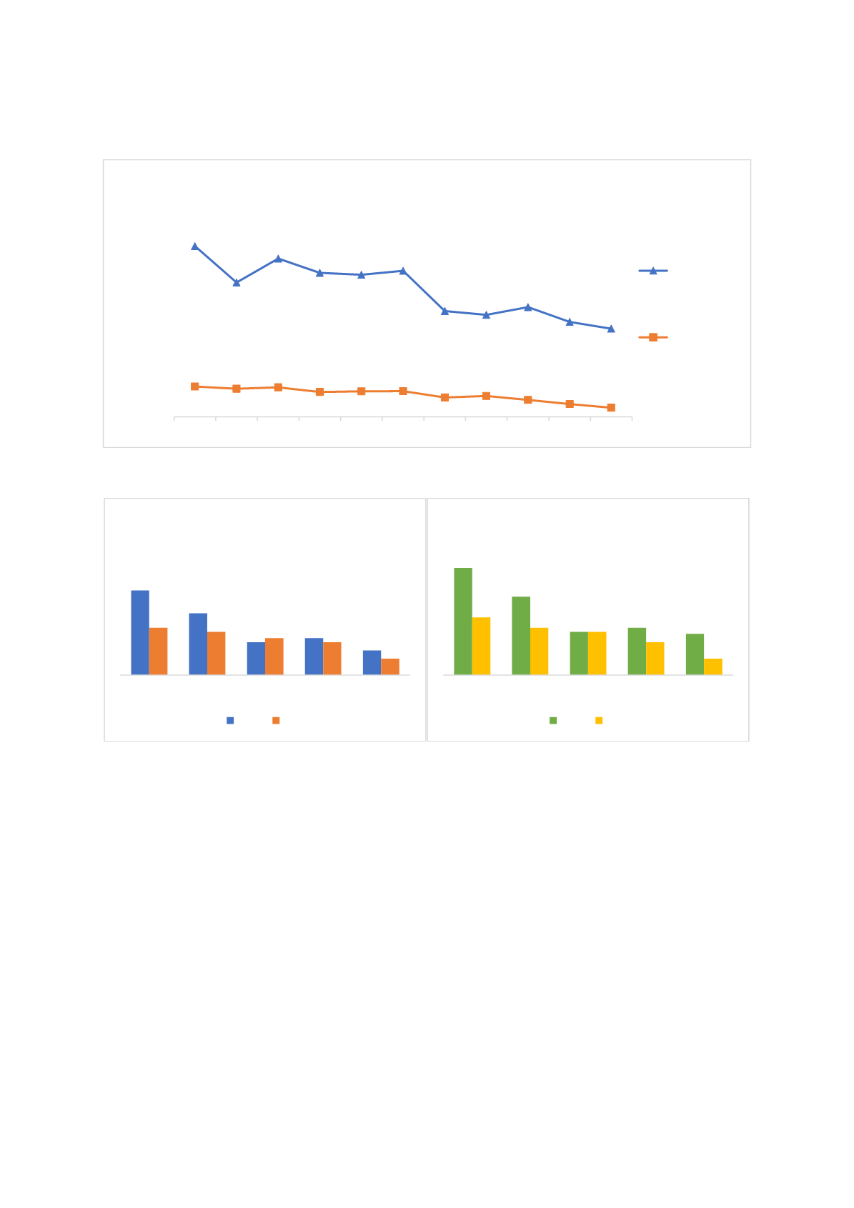
Figure 34: OOP expenditure 2002 - 2012
Source: World Development Indicators
Figure 35: Infant and under-5 mortality rates across wealth quintiles in 2008 and 2013
Source: World Development Indicators
However, it is clear from the graphs above that there are still differences between socio-economic
income groups; with potential for further improvements.
Figure 36shows further substantial
disparities between regions, exemplified by differing maternal mortality rates in 2017. Mortality rates,
e.g. those of infants also still differ significantly across urban and rural areas, although such differences
have decreased over time and are increasingly attributable to socio-economic conditions and different
education levels than lack of access to health services (Tatar et al., 2011). Atun et al.’s (2013)
investigation of the impact of HTP on maternal and child health indicators too showed that
“improvements occurred in all regions of the country, especially after 2003 in the less well-served east
region, rural areas, and in socio-economically disadvantaged groups” (p. 82).
6,0
4,7
5,6
5,1 5,0 5,1
3,7 3,6
3,9
3,3
3,1
1,1 1,0 1,0 0,9 0,9 0,9 0,7 0,7 0,6 0,4 0,3
2002 2003 2004 2005 2006 2007 2008 2009 2010 2011 2012
Share of population spending more
than 10 or 25 percent of household
consumption or income
Out-of-pocket health care expenditure between 2002 - 2012
10% of
household
consumption
or income
25% of
household
consumption
or income
41
30
16
18
12
23
21
18
16
8
Lowest Second Middle Fourth Highest
Infant mortality
2008 2013
52
38
21
23
20
28
23
21
16
8
Lowest Second Middle Fourth Highest
Under-5 mortality
2008 2013